The brand stays. The drawing gets precise.
Same four atoms, same blue, same italic name. Redrawn in vector from the original file, measured instead of traced.
Before: the PNG on the website
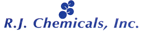
PNG · 500 × 109 px
After: the vector

SVG · any size
Lockups
The original stacked lockup for print and the home of the brand; the horizontal one for headers; the molecule alone for icons.
Stacked, on white

Horizontal, on ink

Molecule, for icons and markers
How it is built.
Four circles fitted to the original by least squares, three bonds cut from the center of each atom toward the next, at the original width. The name is Optima Bold Italic, the typeface of the original logo.
Production note: the name was rebuilt with URW Classico Bold Italic, Hermann Zapf's revision of Optima. The final file uses a licensed Optima or R.J. Chemicals' original artwork.
- Atoms
- r 11.19 · 12.64 · 12.26 · 13.77
- Bond
- 1.75 · center to edge
- Blue
- #1F3E9E
Color
The blue writes: 9.4 to 1 on white. Amber only fills; on light backgrounds amber text becomes bronze.
Type: one family and a notation.
Host Grotesk for headings and text; its italic answers the italic name. Martian Mono for everything that is notation: CAS numbers, grades, lots, quantities, dates.
Documents before the PO
Bulk pharmaceutical and veterinary active ingredients, Host Grotesk 400.
CAS 73590-58-6 · PELLETS 8.5% · RJ-OME85-2609-014
The signatures
The bond under the key word of each heading. The drum label for every product. The atom as a circle for photos and markers.
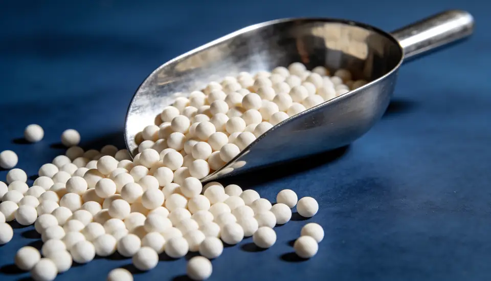
Photography
- Real materials: powders, pellets, drums, documents, plants, ports
- No people generated by AI; portraits are requested
- No syringes or injectable vials: R.J. Chemicals does not sell them
- No readable text, logos or brands on objects
Voice
- Precise and short, like a good certificate
- Molecule names spelled right, always
- Never “FDA approved”, “best”, “leading”, “guaranteed” or “free”
- Documents are “confirmed per product”